
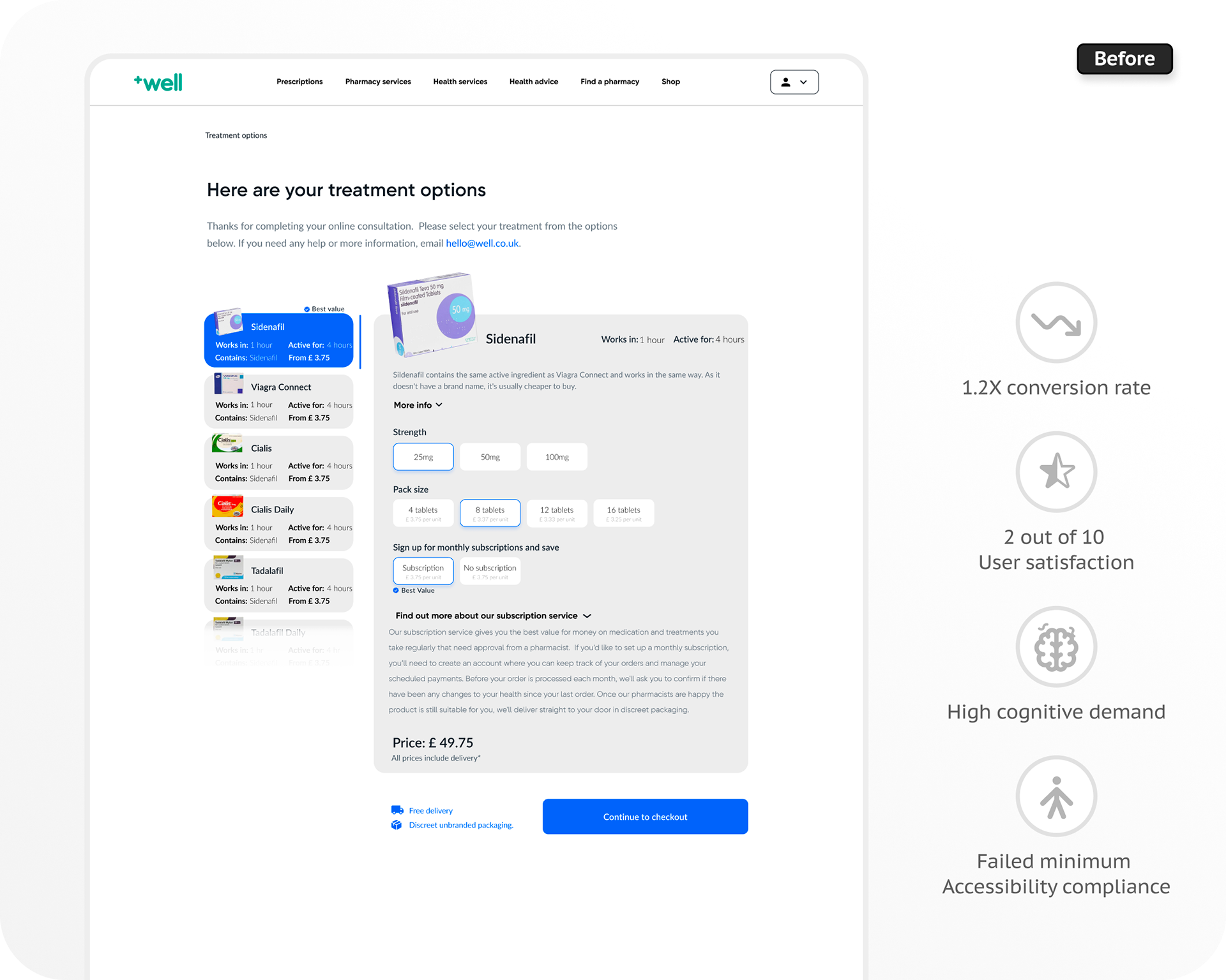
Problem overview
Well Pharmacy is the UK’s second-largest pharmacy chain, that provides a wide range of NHS and private healthcare services.
Our analysis of Amplitude data evidence a consecutively large number of customers dropping-off during the product comparison screens within the erectile disfunction online consultation flow.
Our hypotheses were that due to lack of clarity in the UI design, dense and complicated design structure and cognitive high-demand experience, and among others, customers were abandoning the UX flow, leading to negative feedback and drop of sales for the business.
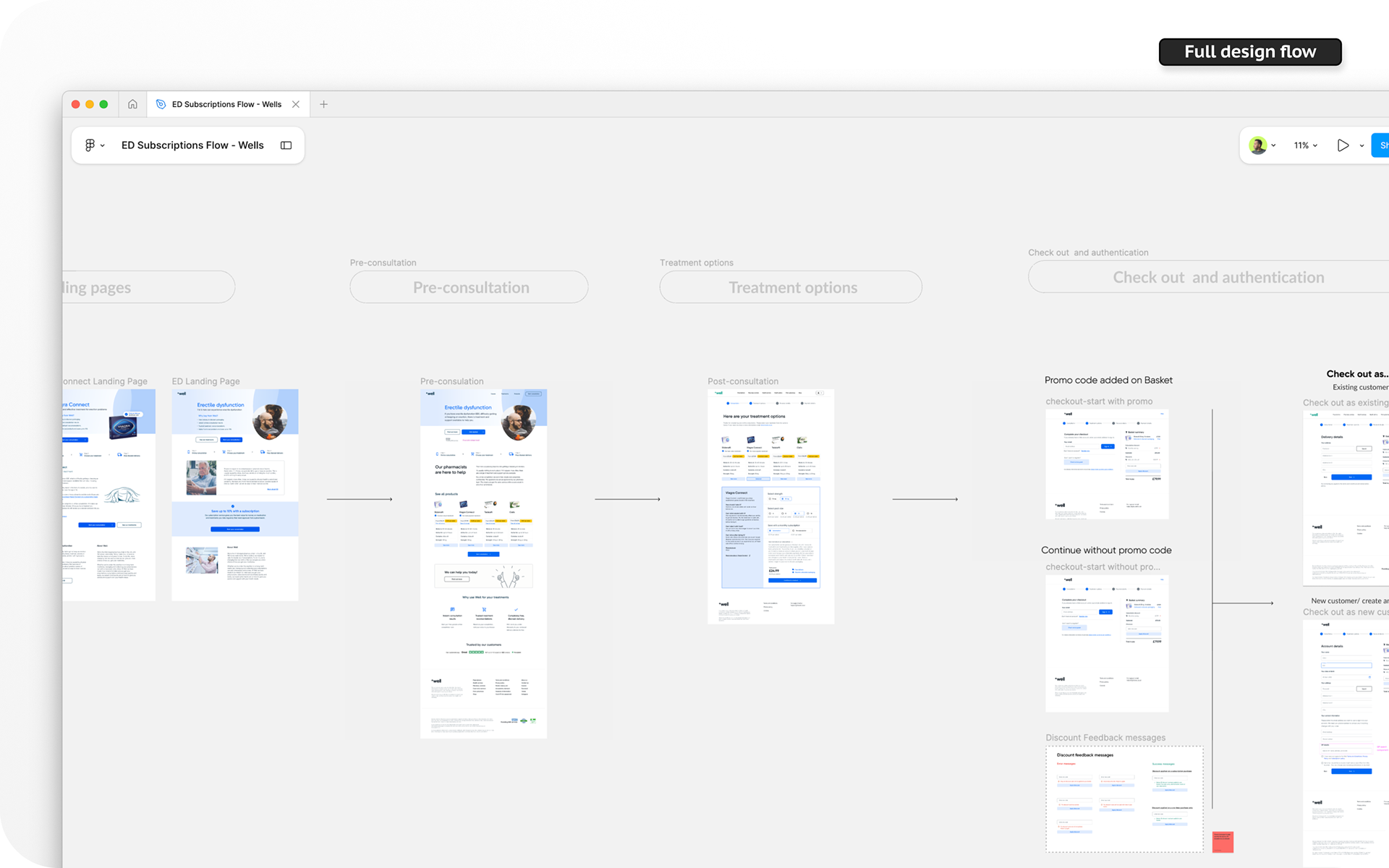
Design Process
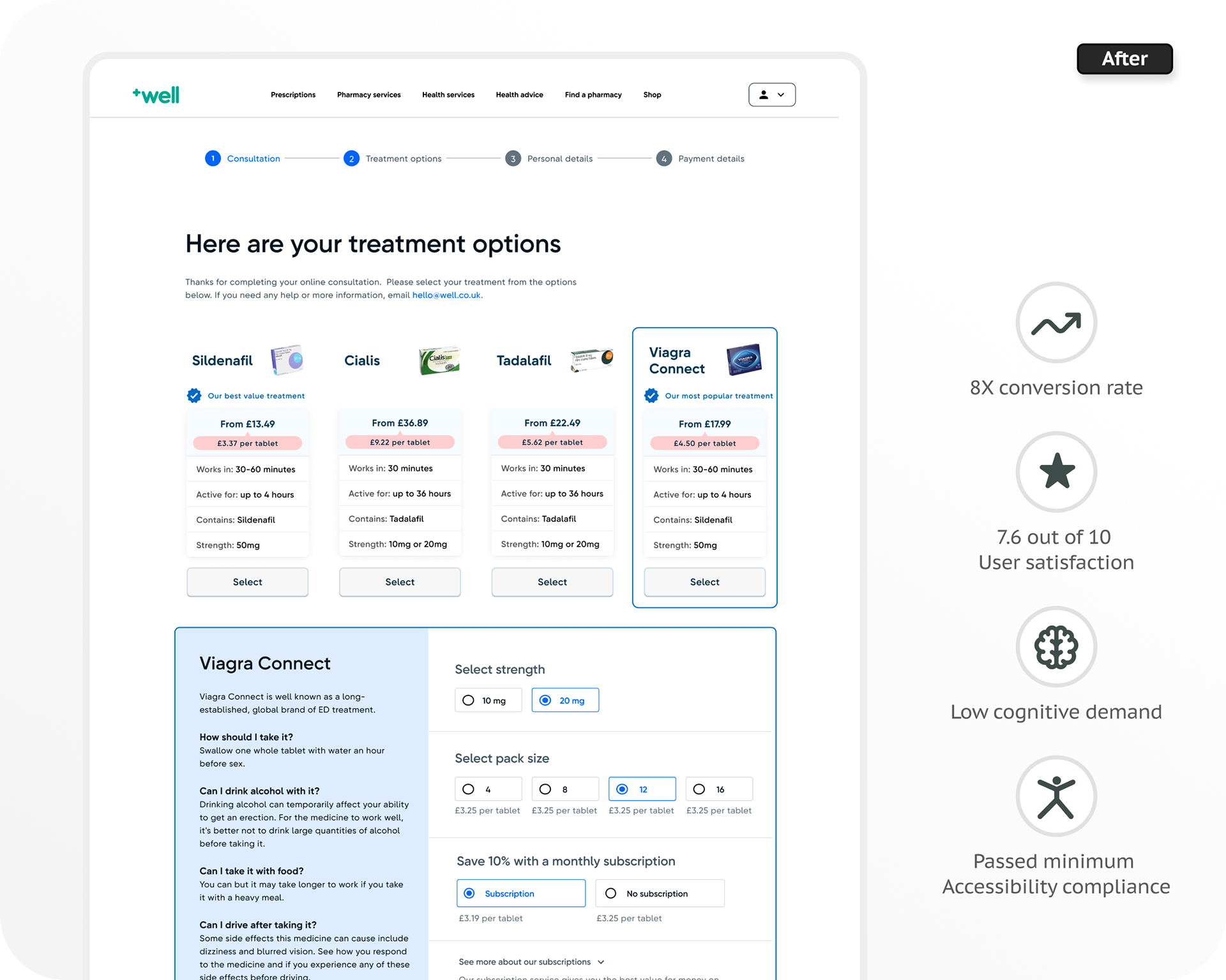
During three iterative agile sprints, I redesigned the UX/UI design and interaction of the product comparison flow. Enhancing the clarity, accessibility and navigation process but overall removing the burdensome and complex UX decision-making steps for the customer.
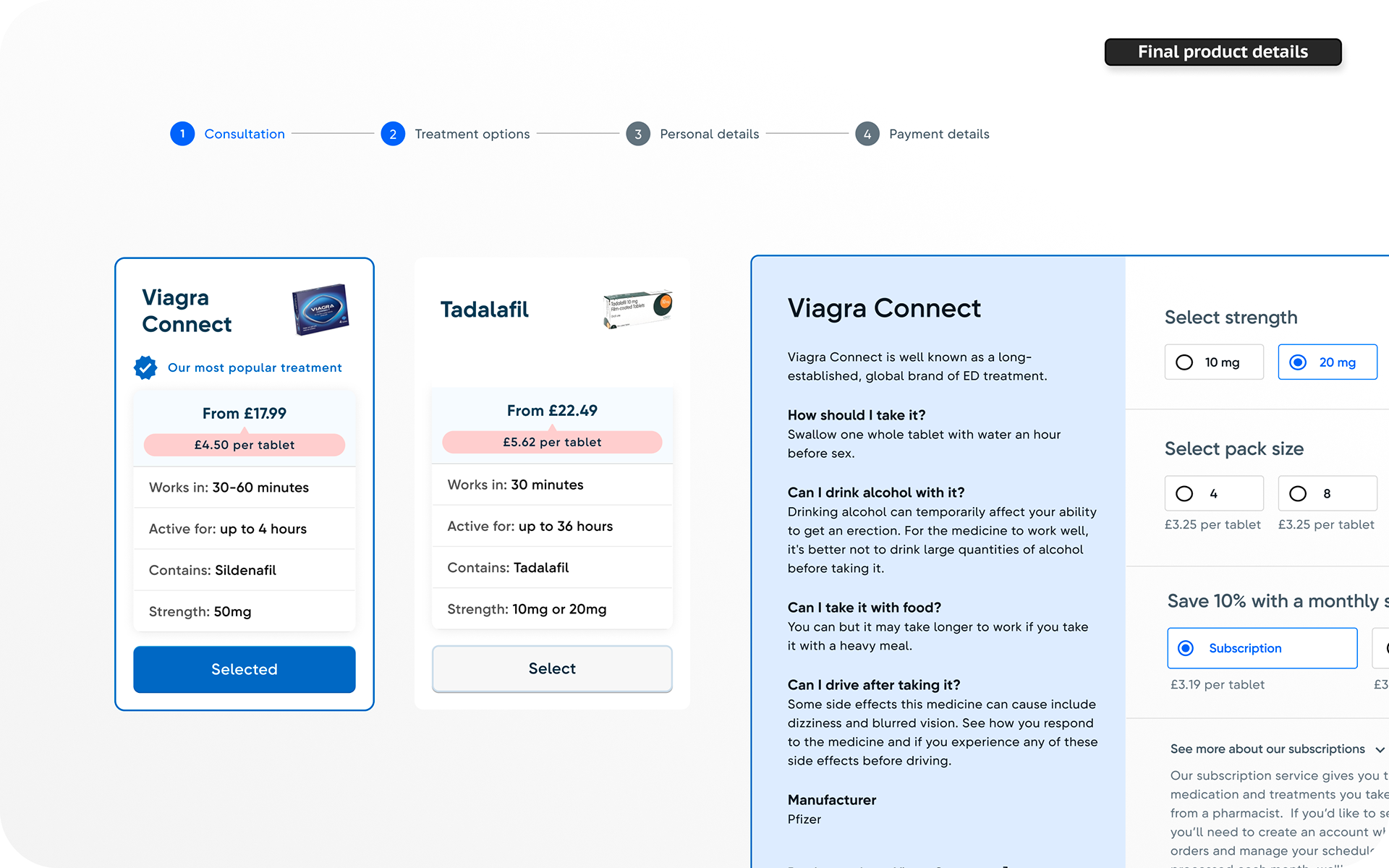
Results showed an increase of 8% of sign up prescriptions services with more than 30K new customers and increment of overall product satisfaction in usability tests. Conclusion metrics were set for a period of 6 months in A/B test controlled session.
☕️
Would you like to learn more about this,
have a coffee or start improving your digital products?
Would you like to learn more about this,
have a coffee or start improving your digital products?
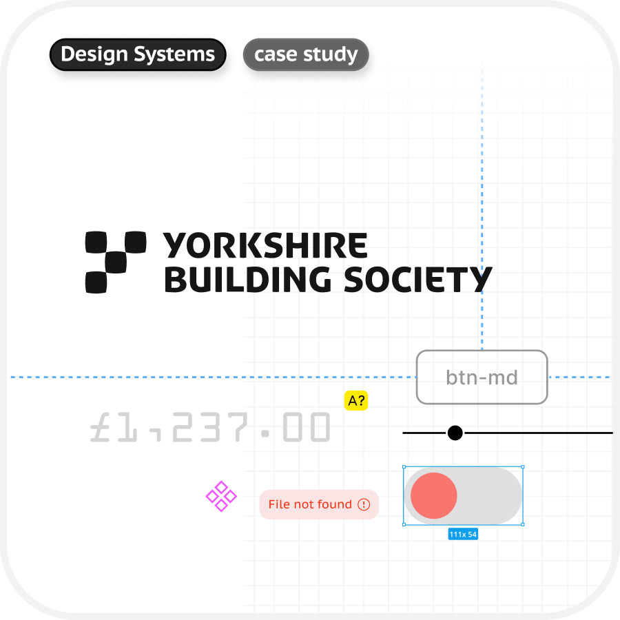
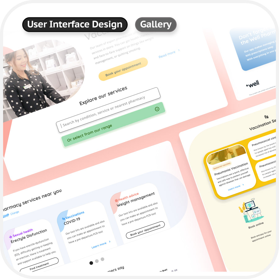
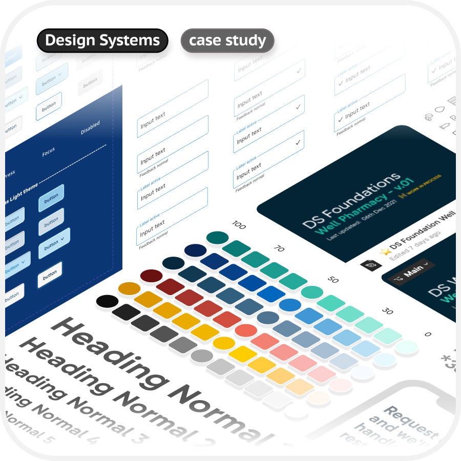
Some images in the process are omitted or uncompleted due privacy and confidentiality purposes.