
During my time in Well Pharmacy, I led the creation of an accessible design system foundation for the digital services team. Working with a small group of designers and engineers I helped define the system structure, built the core libraries in Figma, and created the documentation needed for adoption.
This is a brief case study of how it came together.
This is a brief case study of how it came together.
(*1) "A design system is a set up structure of design decisions, processes and UI libraries that help teams to efficiently build scalable and consistent digital products" - viro
Role: Design System Designer / Senior UI Designer Company: Well Pharmacy. Manchester, UK
Deliverables: Design System Core Libraries - Accessibility - UI Audit - Documentation
Duration: ∼9 months Year: 2021
Deliverables: Design System Core Libraries - Accessibility - UI Audit - Documentation
Duration: ∼9 months Year: 2021
The Problem
Almost every UX/UI project started with the same friction.
❌ Design files cycled through endless “final final” versions.
❌ Libraries drifted out of sync across teams, and components in Figma were inconsistent, inaccessible, and often missing basic build practices.
❌ Collaboration became constant back and forth just to resolve mismatches, all while deadlines kept moving.
❌ Libraries drifted out of sync across teams, and components in Figma were inconsistent, inaccessible, and often missing basic build practices.
❌ Collaboration became constant back and forth just to resolve mismatches, all while deadlines kept moving.
To design, iterate and collaborate better we would need to set a consistent, reusable and efficient design system (*1).
Design Process
Research & Discovery
To clearly define the problem and goals I learnt how teams worked day to day, how products were shipped, and what had worked and what hadn’t. That gave me a clearer view of where a design system could create the most value.
Three challenges came up repeatedly.
Accessibility gaps in foundational libraries:
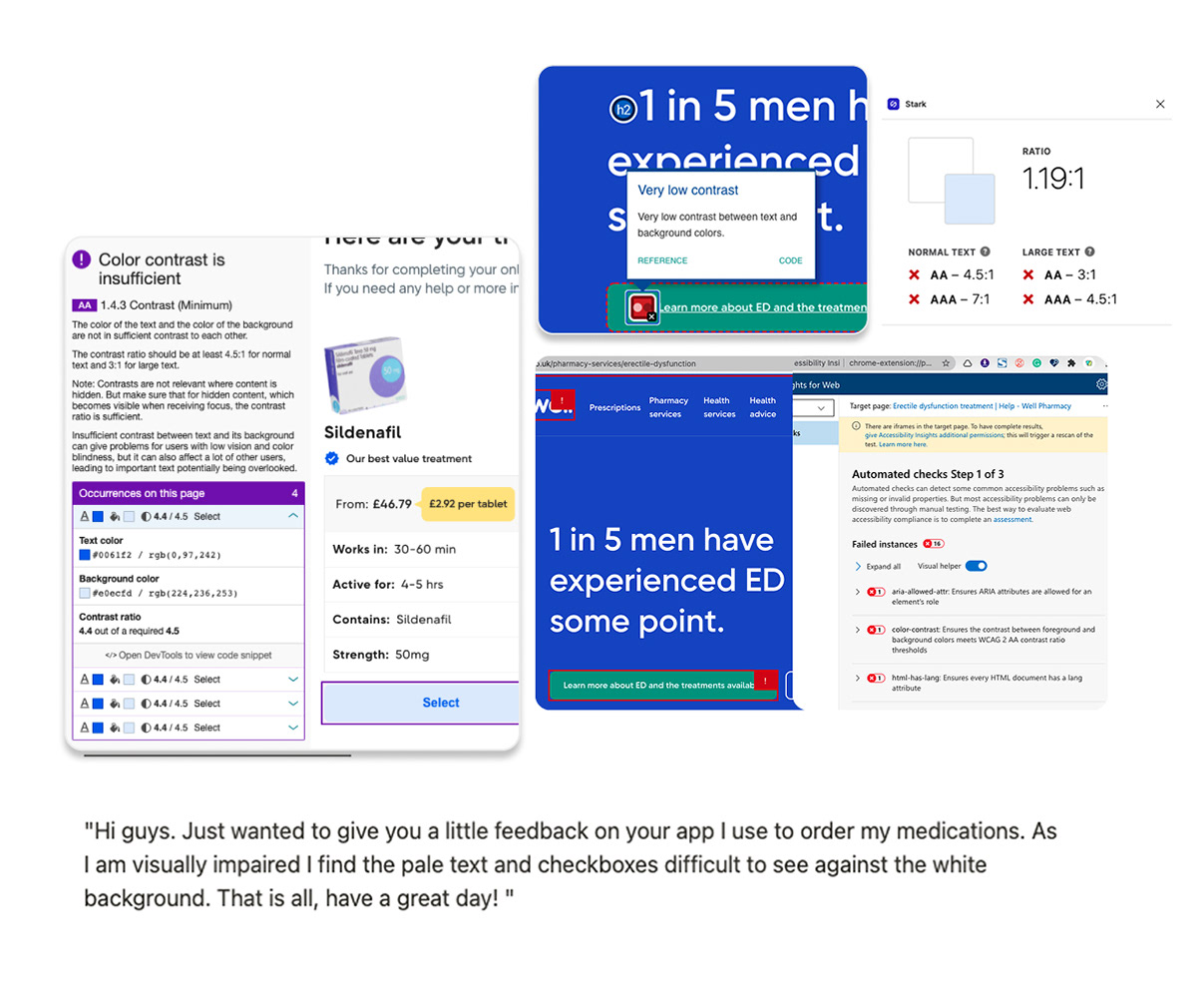
Colour and typography libraries failed a minimum standard for WCAG. Former colour libraries were mainly set up from printing values and never translated to digital settings, affecting quality and accessibility of components.
Inconsistent components and undocumented decisions:
Inconsistent components and undocumented decisions:
There was no single source of truth. Components lacked core UI practices such as Auto Layout, constraints, consistent states, and clear behaviour. Decisions lived across scattered Figma files, old Notion pages, or word of mouth. This made consistency hard and onboarding slow.
Disconnected design workflows:
Because deadlines and personal objectives drove delivery each team developed its own way of working. The issues were not only technical. They reflected deeper workflow and alignment problems.
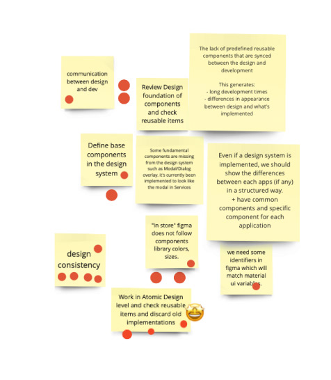
Compilation sample of issues found during discovery stage
Design definition
Based on the most critical team pain points and the business need for faster product delivery we set two minimum viable goals.
⚡️ Create a functional core component library in Figma that supports teams across platforms.
⚡️ Build a documented, reusable, scalable and accessible design system.
⚡️ Build a documented, reusable, scalable and accessible design system.
Technical design work
To create a strong foundation I proposed adopting Brad Frost’s Atomic Design framework. It gave us a clear cascade from foundations to components and a single source of truth that could scale without drifting. Throughout all the process I iterated with other designers, reviewed patterns in real work, and adjusted based on feedback. Each improvement was shared, explained, and documented to drive adoption and consistency.
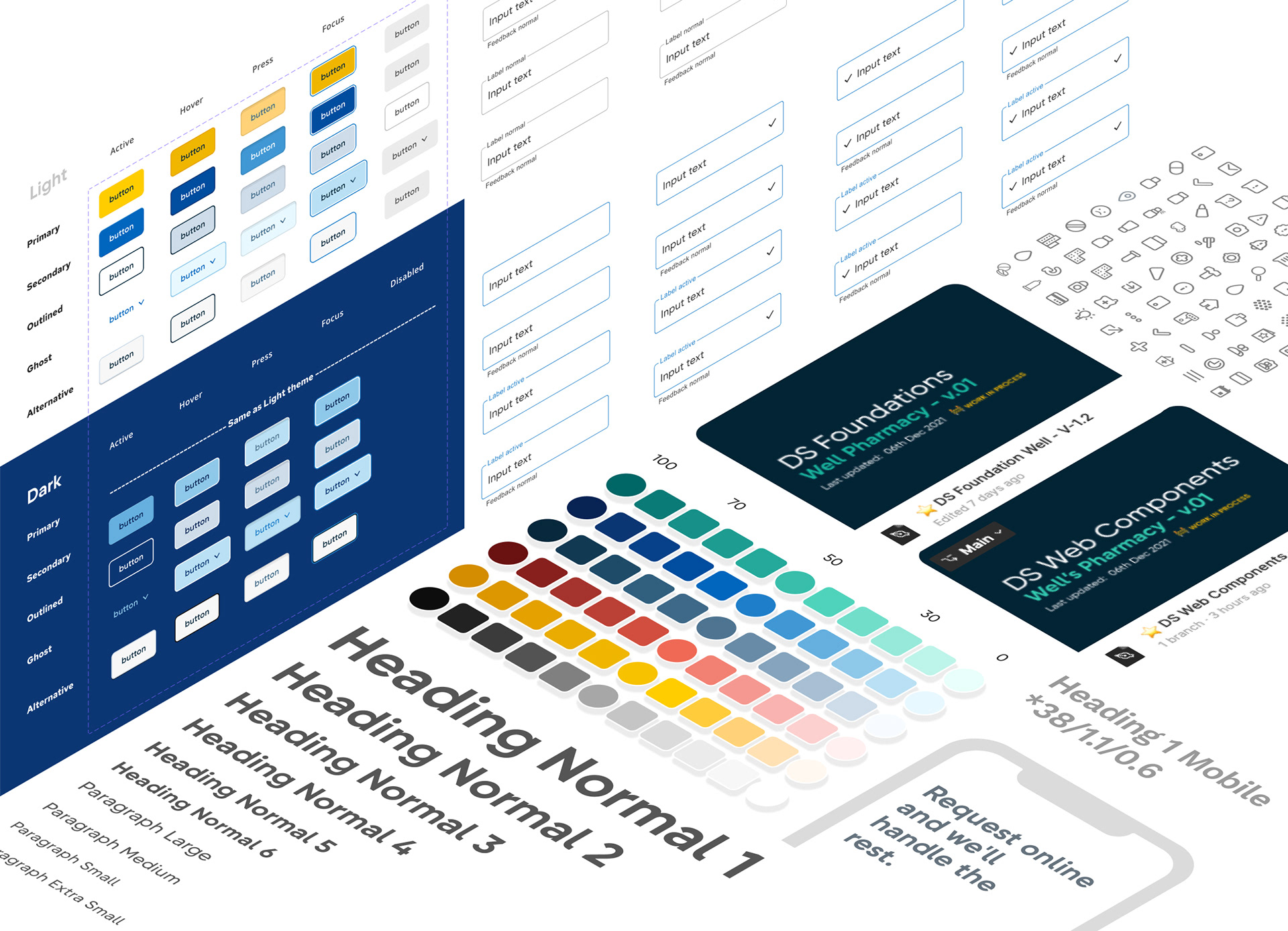
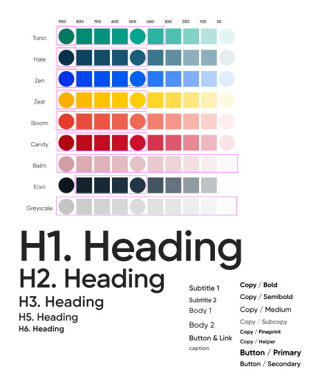
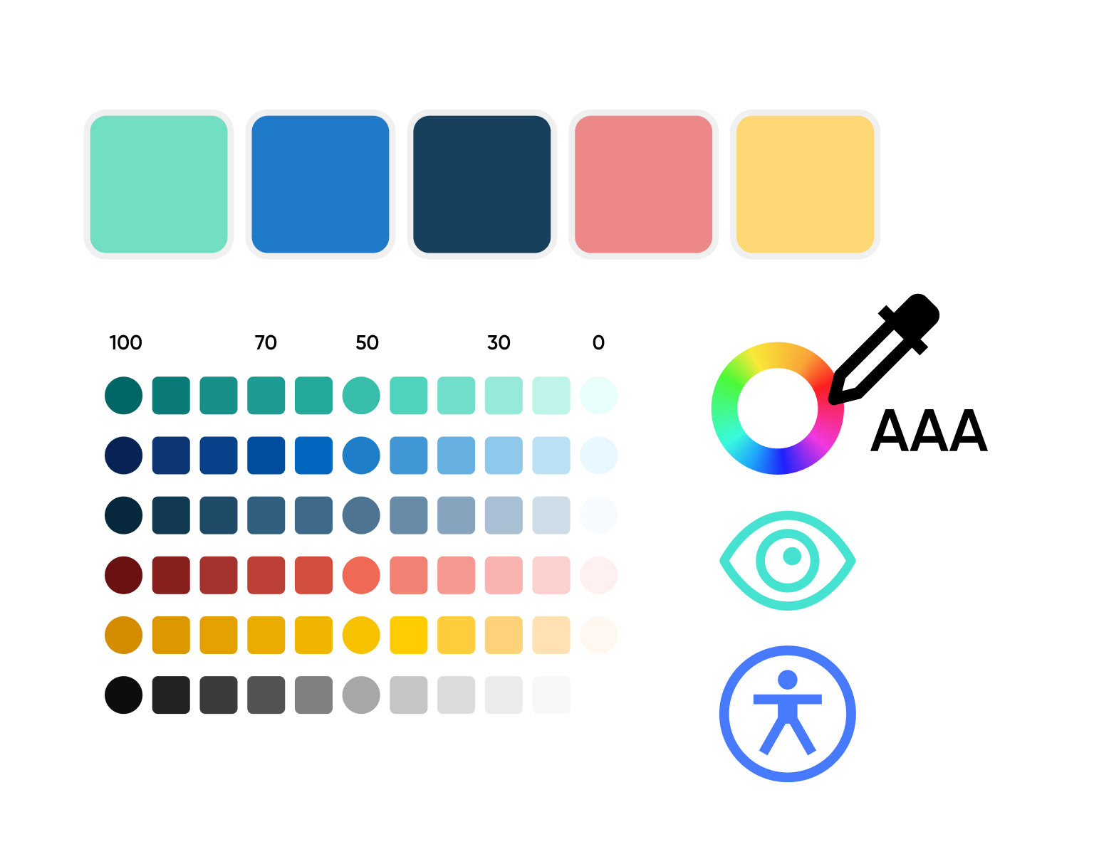
Colour - Where accessibility meets design.
Using tools like ColorBox and Adobe Color I rebuilt the palette to meet accessibility requirements while staying aligned with brand identity. I removed unnecessary hues and introduced a more practical approach for digital use.
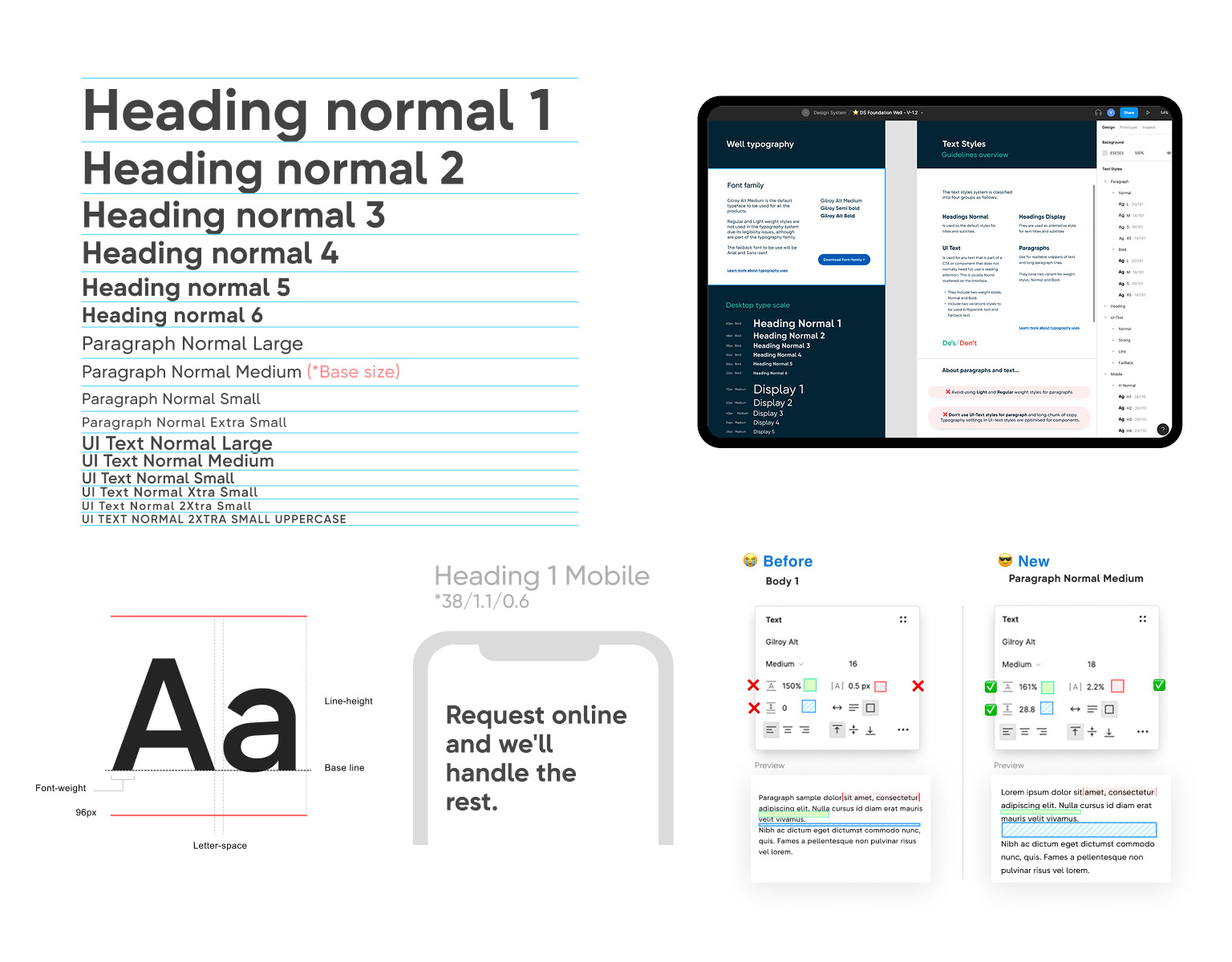
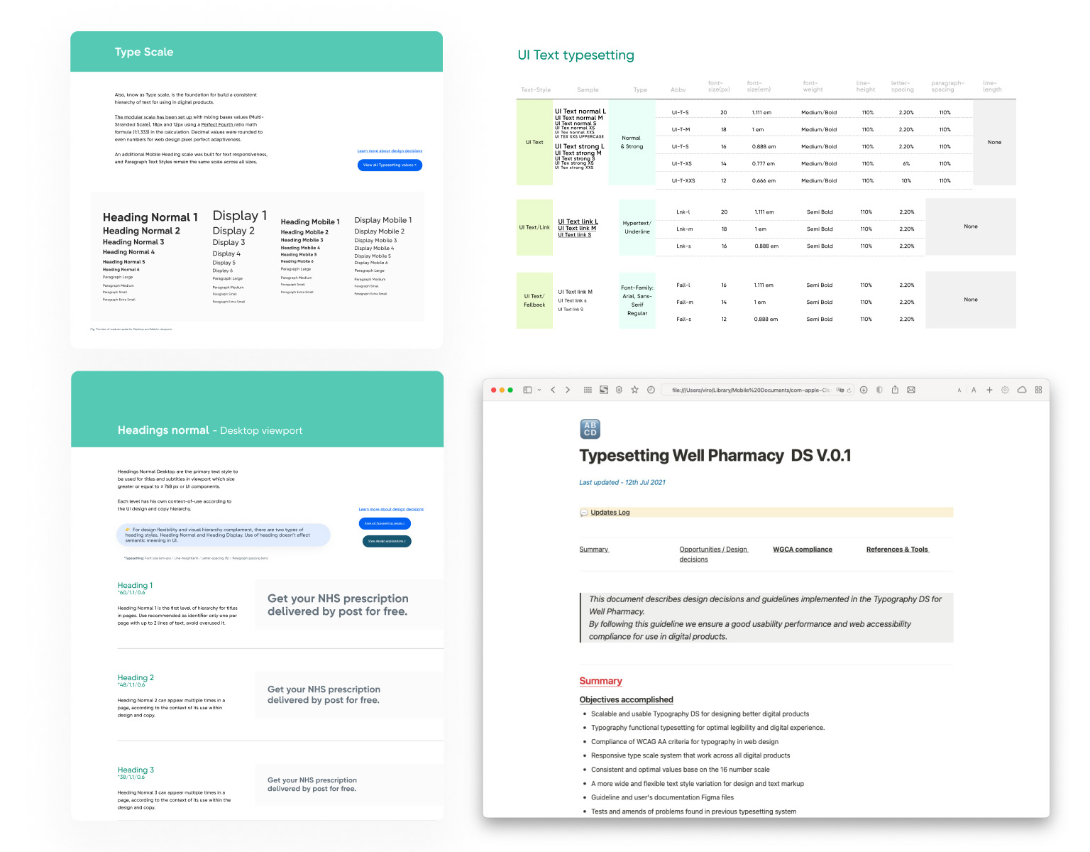
Typography system
I created a typography system with a clear hierarchy and a consistent type scale optimised for legibility. Usage rules and specifications were documented in Notion and in Figma. I also added comments inside key areas of the Figma library to help designers apply the system correctly during daily work
Documentation in context
I created cross referenced, contextual documentation across Figma components, a Notion design hub, and production examples supported through Storybook. This reduced the learning curve and improved accuracy in design and delivery.
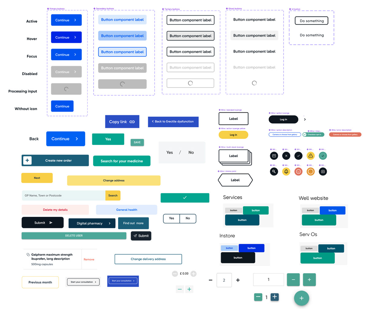
Reducing complexity with 'Matrix Component'
To maximise reuse and mirror frontend conventions I introduced a Matrix component design technique in Figma. The idea was simple. Build core elements that cascade through controlled variants. This reduced variant sprawl, kept text styles synced, simplified updates, and lowered the overall weight of the library.
The Matrix component built in Figma used a single core component which cascades through all the rest of variants and allow to replicate multiple styles and sizes without having to create additional variants.
In the following example the 'CoreBTN' component which is the Matrix of the button, acts as the foundation for sizing and structure, whilst the 'Button' upper level variant control styles and states.
In the following example the 'CoreBTN' component which is the Matrix of the button, acts as the foundation for sizing and structure, whilst the 'Button' upper level variant control styles and states.
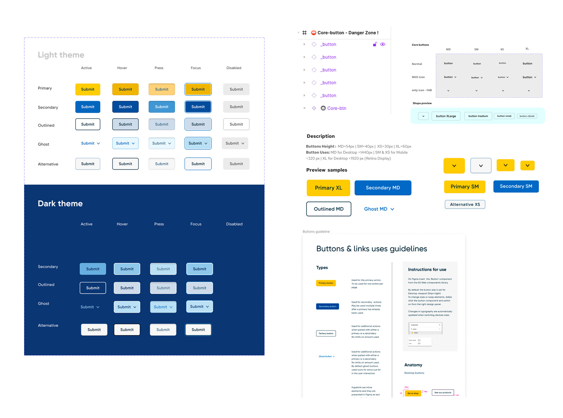
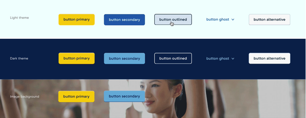
Button component kit prototype with multiple themes using a single Matrix button component.
Learning and Outcomes
After three months of pilot testing and refinement we released Well Pharmacy Design System v0.1. It began spreading across other product areas including sign up flows and service journeys.
Delivery speed, iteration efficiency and collaboration improved drastically by 150%. The team spent less time rebuilding UI patterns and fixing visual inconsistencies and more time delivering new UX improvements.
Most importantly the design system achieved AAA WCAG compliance. This strengthened stakeholder confidence, supported NHS partnership requirements, and improved accessibility for Well’s most vulnerable customers.
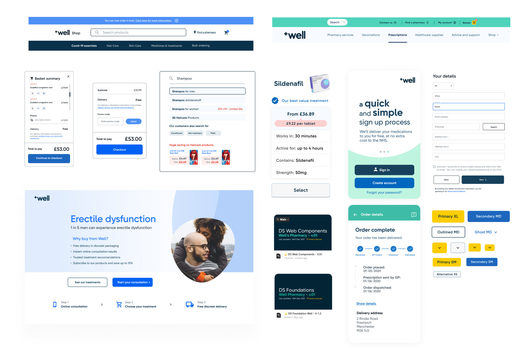
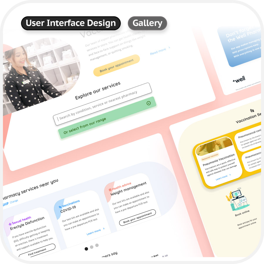
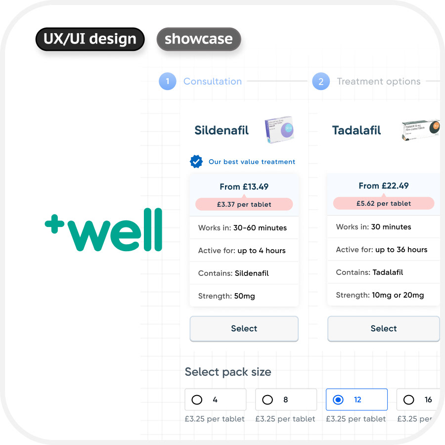
Screenshot of new components based on new design system implemented for Services and Shop.
Compilation of design system assets including UI, styles and documentation.
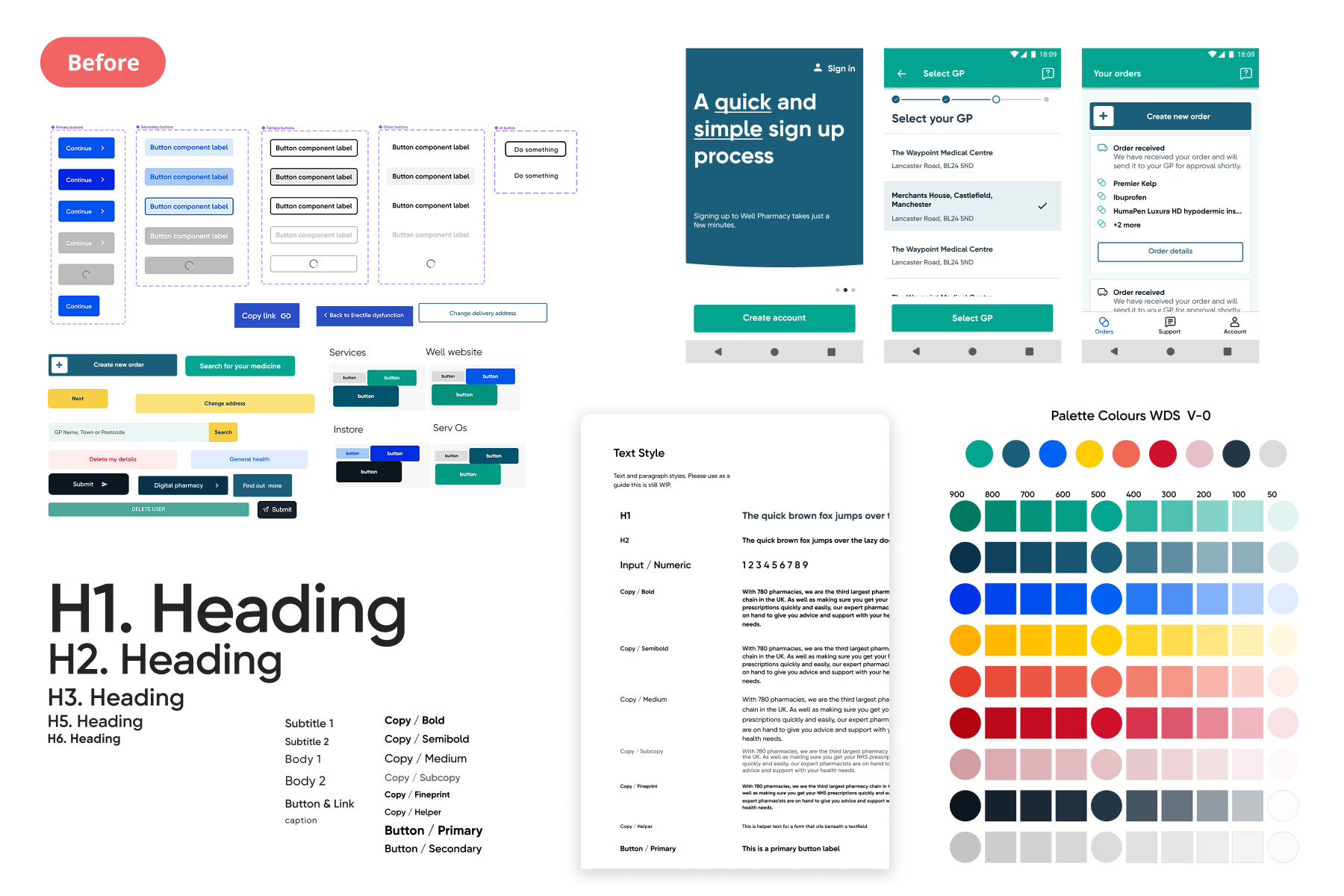
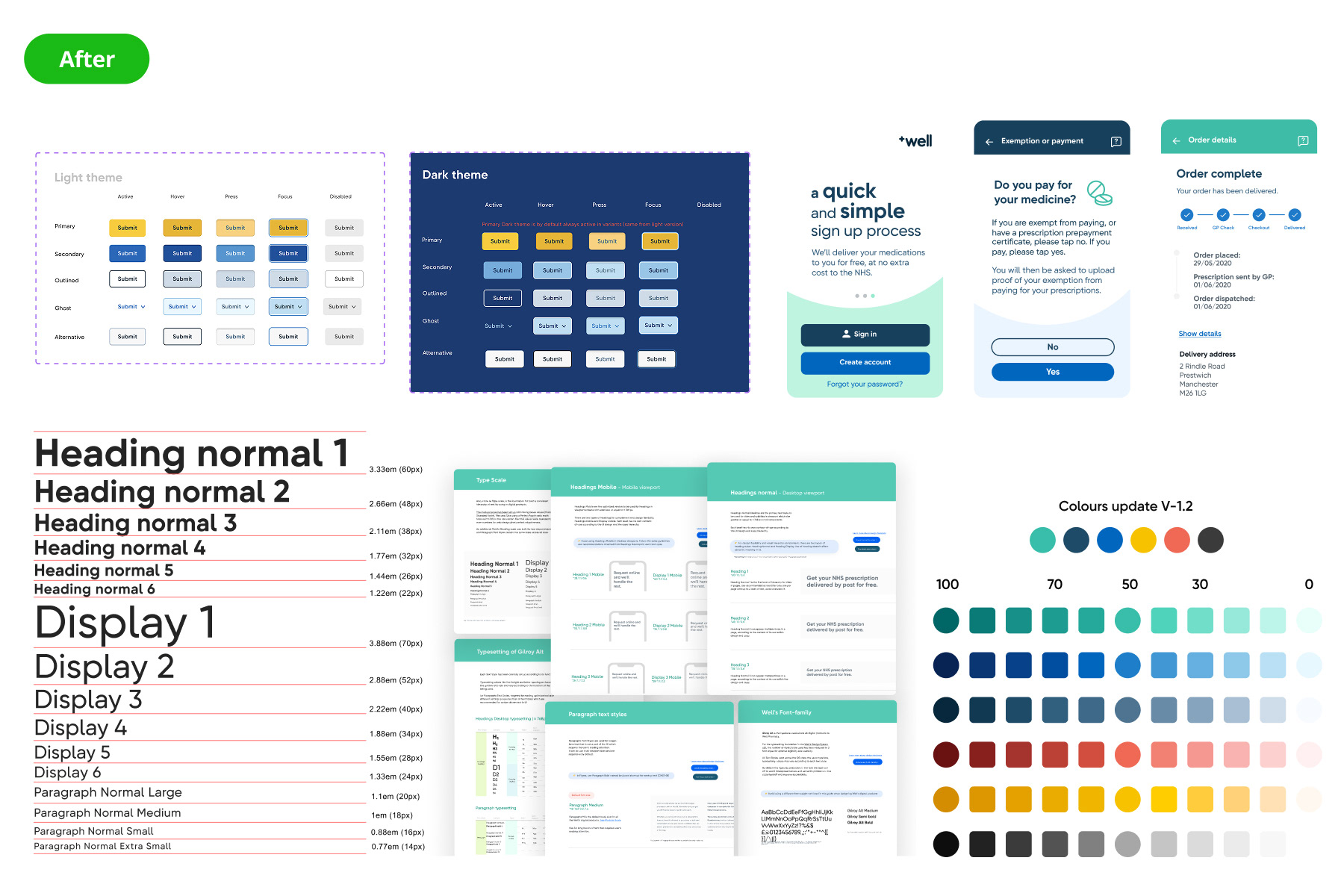
Left side: former design system. right side: new built
Left side: former design system. right side: new built
" Design systems are constantly evolving and adapting, having a well-crafted from the root means hundreds of working-hours saved, improved team sync and flawless escalation for product design. For this project, I set the cornerstone for evolution and growth of the brand in compliance with accessibility standards and advance design techniques."
Some images in the process are omitted or uncompleted due privacy and confidentiality purposes.